Completed Magazine Cover
- jackmgoodman05
- Mar 31, 2021
- 1 min read


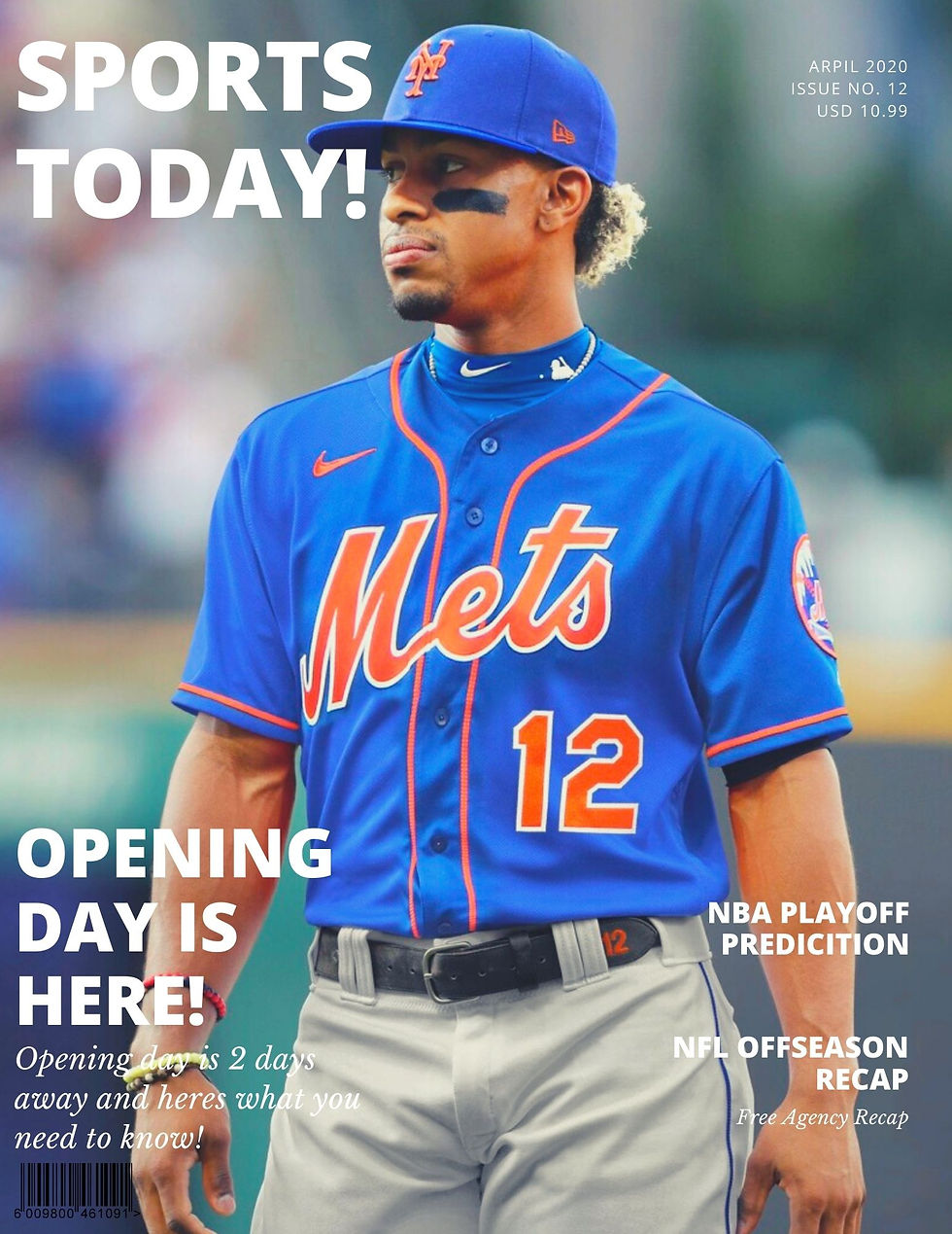
From my first magazine cover to my final I have made many improvements. From the top (the oldest) to the bottom (the newest) you can see the many visual improvements. On my newest cover for texts, instead of having many different colored words, I chose a neutral color that would work for everything. Then I chose a simple yet clean font that read some of the storylines. Also, I did not think the extra textbox around the title was necessary like I did in the second one. I included in the top right the month, issue, and price which I did not do in the other two. Overall, I think this has improved a lot from my other 2 covers as I kept it clean and simple.
Photo Credits: (2021, January 07). Retrieved March 31, 2021, from https://pubsportsradio.com/francisco-lindor-traded-to-the-new-york-mets-instant-reaction/

Comments